Google exposes a lot of information through APIs. Among these, is the information in Google Search Console. I have created a small sample program to get data from the Google Search Console API using Python to experiment with these APIs.
The code for this article can be found here.
The Google API Python client
This Python package can be used to call many different Google APIs with minimal setup. Creating the interface to the Google Search Console APIs is as simple as running
service, flags = sample_tools.init(
    sys.argv,
    "searchconsole",
    "v1",
    __doc__,
    __file__,
    scope="https://www.googleapis.com/auth/webmasters.readonly",
)
This requires you to install oauth2client using
pip install --upgrade oauth2clientand to define a client_secrets.json containing
{
    "installed": {
        "client_id": "<client-id>",
        "client_secret": "<client-secret>",
        "redirect_uris": ["http://localhost", "urn:ietf:wg:oauth:2.0:oob"],
        "auth_uri": "https://accounts.google.com/o/oauth2/auth",
        "token_uri": "https://accounts.google.com/o/oauth2/token"
    }
}
Generating the client_id and client_secret can be done through Google Developers Console > Credentials.
Getting daily data for the last month
Once the interface is set up, getting the daily data is super simple:
end = date.today()
start = end - timedelta(days = 30)

body = {
    'startDate': start.strftime('%Y-%m-%d'),
    'endDate': end.strftime('%Y-%m-%d'),
    'dimensions': ['date']
}

query = service.searchanalytics().query(
    siteUrl='<your-site-domain>', body=body
).execute()
Detailed documentation can be found here.
If you are unsure which siteUrl to use, you can get all of them through:
sites = service.sites().list().execute()This can be useful because for example domain properties are prefixed with sc-domain and this way you can verify what the correct value is.
Creating graphs of impression data
Using Matplotlib, it’s super easy to create graphs in Python with very limited effort.
Continuing from the previous piece of code:
query = service.searchanalytics().query(
    siteUrl='<your-site-domain>', body=body
).execute()

data = [{'date': row['keys'][0], 'impressions': row['impressions']} for row in query['rows']]

x = [datetime.strptime(element['date'], '%Y-%m-%d').date() for element in data]
y = [element['impressions'] for element in data]

fig, ax = plt.subplots()
ax.plot(x, y)
ax.xaxis.set_major_formatter(DateFormatter('%m-%d'))

plt.show()
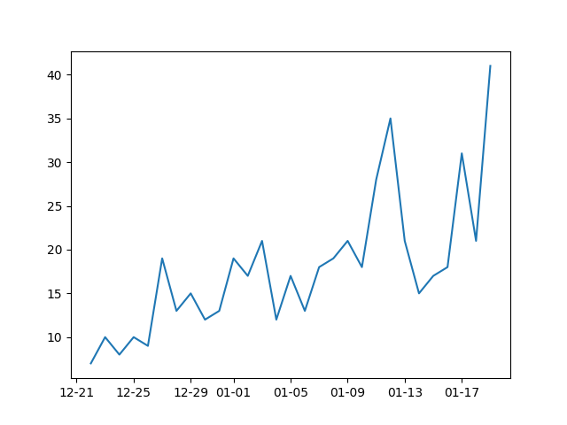
The first step is to iterate through the data and create a dictionary that contains the relevant data, in this case, the date and number of impressions. The next step is to create two arrays that represent the x and y-axis. Here all dates are transformed into a format that can be used in Matplotlib. Finally, the graph is created using Matplotlib.
The result will look something like this:
